

The Movement of Light
Facilitating the Opportunity for Communion

Although I do not teach iconography, I want to document my own process for any aspiring or experienced iconographers who may be interested. The techniques make sense to me, and that’s the main reason I use them. Other artists may find more or less of these things useful, and that’s okay. But it’s my greatest hope that something here will help with the development of another iconographer, as well as help foster a deeper devotion to the organic icon in Orthodox Christians.
Movement I: Contemplating the Image
The painting of the icon begins before I’ve ever picked up a brush to sit down with the panel. It begins with the contemplation of the image to be painted, imagining each step that will be taken as thoroughly as possible, and with the certainty that Christ’s image will be self-imprinted as I move closer to completing the painting.
For me, I typically hold a couple of beloved icons from Fr Gregory and Ouspensky in mind. I may sometimes also hold something more contemporary from Seraphim O’Keefe or Todor Mitrovic along with these. I also find it important to look at copies of these images separate from the time I’m painting to avoid an over-reliance on them and to paint, as much as is possible for me, straight from the heart.


In spite of those pesky demons who remind you of how worthless and despicable and pathetic you are for even trying to be an artist, you must raise the name of Christ against them. Do not let them tear you down. You must carry this trust in the Lord from the beginning, that He will be Who imprints His image.
But do not imagine this to be a cure or replacement for a lack of dedication to the craft or trade skills necessary for the labor of iconography. The mileage of practicing drawing and painting has to be accumulated over time. I do not want anyone to read posts like these from me, nor from anyone else, and imagine that it’s a super easy thing to do. This works requires a serious commitment beyond attending a few workshops. Nevertheless, the person who has been acquiring that mileage and experience relies on Christ for success in their work.
Movement II: Preparing the Panel & Drawing
The panel should already be complete, either by ordering pre-made panels or them yourself. I make my own in a very simple manner: High quality plywood cut to the appropriate dimensions, sized with a glue to prevent support induced discoloration, and then gessoed with at least 4 coats of Easy Gesso from Natural Pigments. I also add a bit of orange ochre pigment to the gesso to make it a warmer tone. The ratio is approximately 1:1:1/8-1/4 (mix to water to pigment).


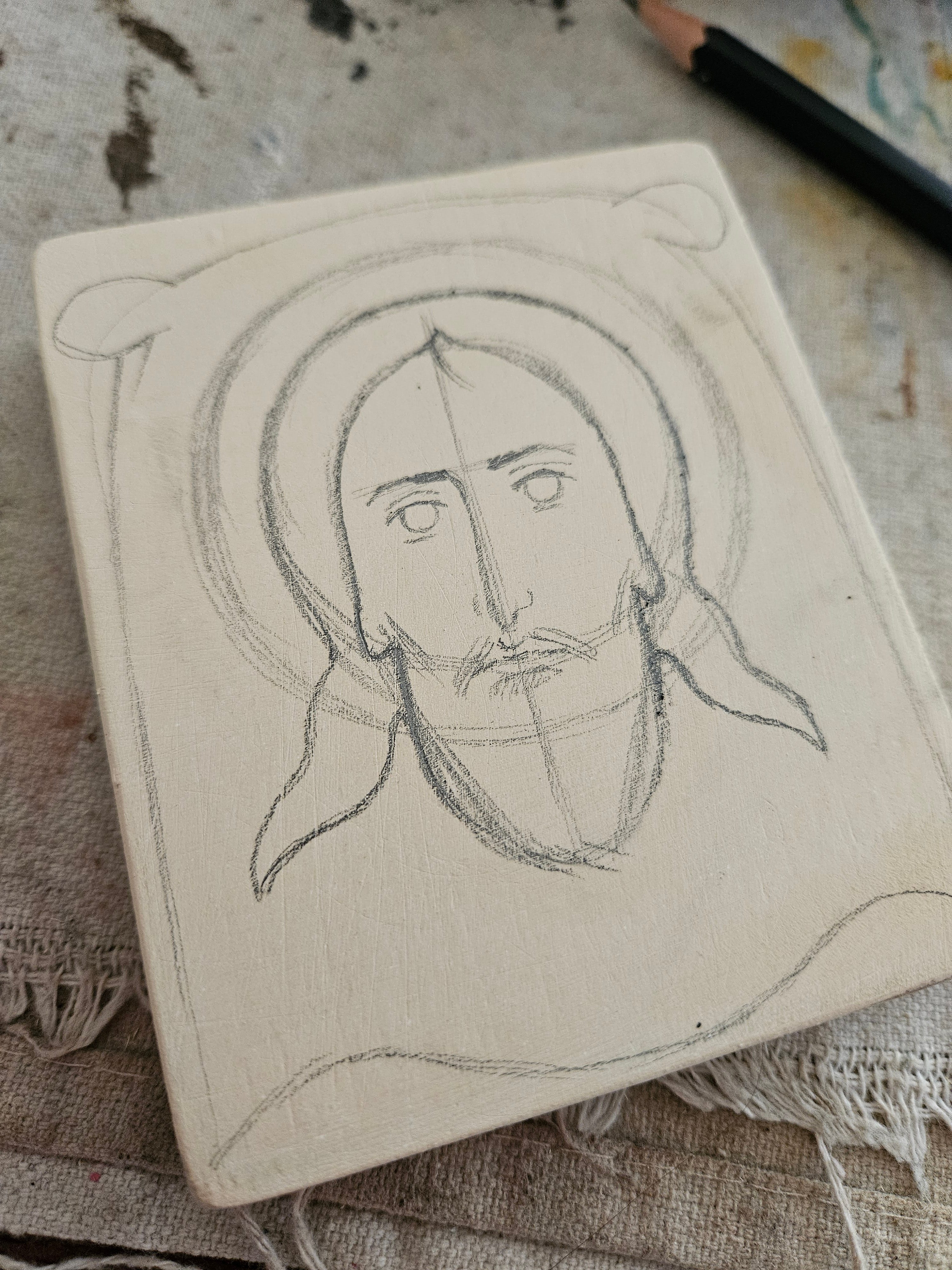
I’ve already practiced drawing and painting the Mandylion icon many, many times. Preliminary drawings are not required for me any longer, but I still draw a sketch on the panel to help with places the largest shapes/forms/bodies of color.
Movement III: Establishing the Major Shapes
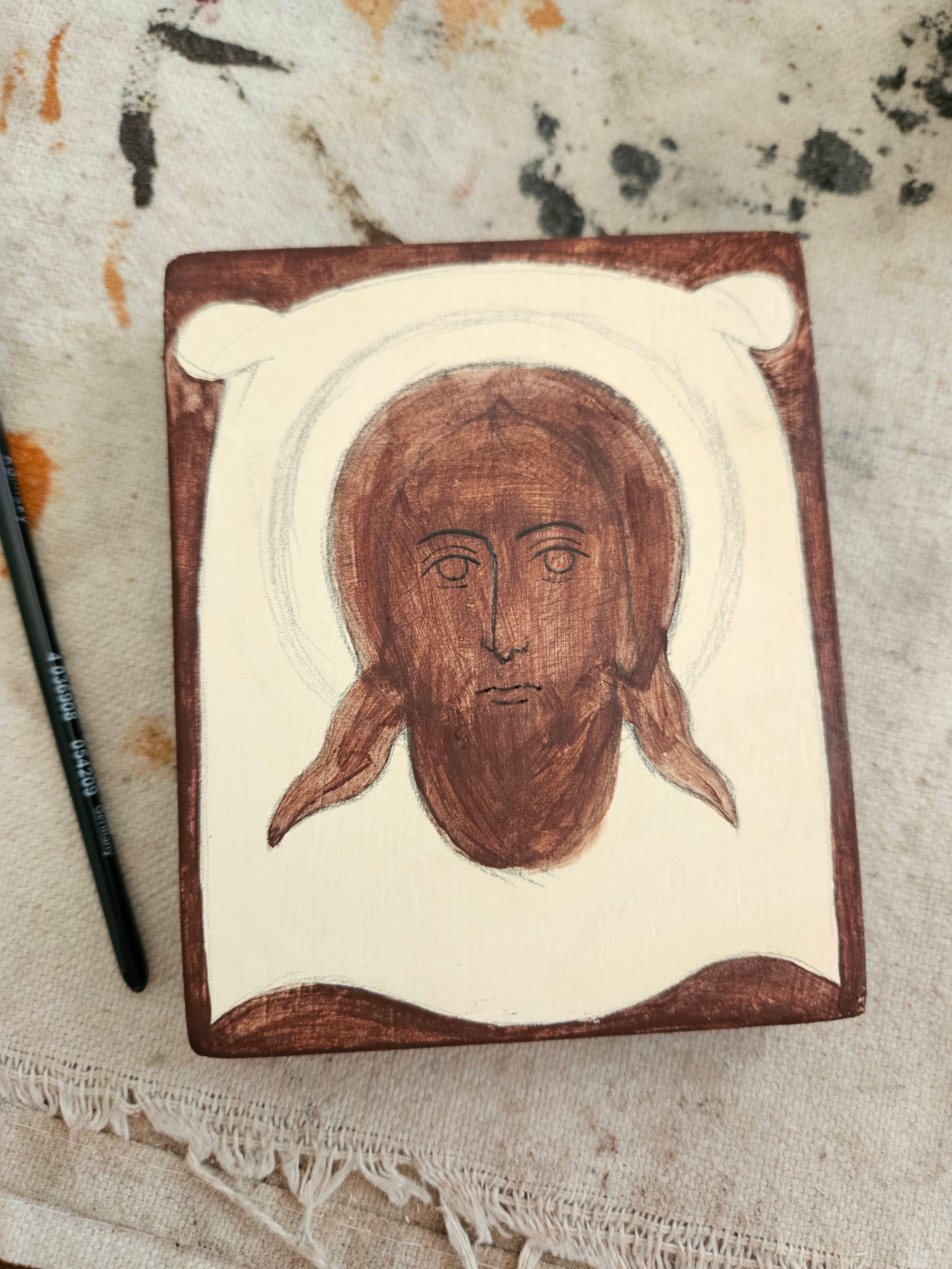
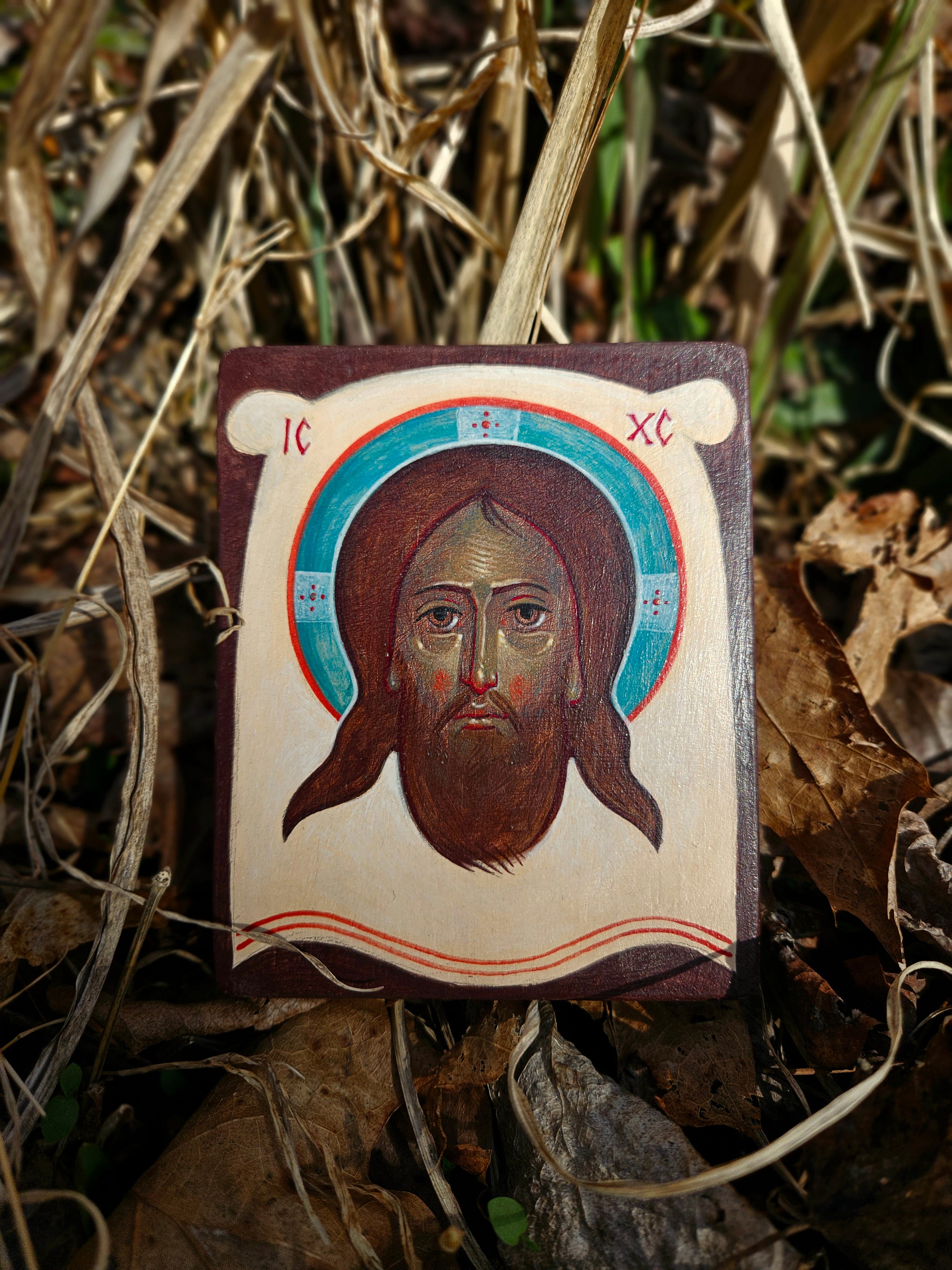
The major shapes are the first to be painted. One of the ways I have found a unity of color in my work is by applying the same base color to all the major forms. In this example, I have left the holy cloth unpainted as a negative shape. The positive shapes are the Face of Our Lord and the background. This creates silhouettes from the two forms which are essential for comprehending the image: the Face of Christ on the cloth.
Other icons may demand a great quantity of complex shapes, and all in relation to one another, but this particular icon is quite simple. I am convinced at this point of my journey as an iconographer that mastering one particular model will carry you a long way.
My paint is relatively thin/transparent at this point. I am not after solid colors. I want there to be room for the lightness of the gesso to pass through these layers for a while. Perhaps we could say that we are letting the panel “breath” or giving it room to accept more color later on. I’m using Blue Ridge Violet Hematite for the base tone. Although on camera the pigment seems to be very brown, seeing it with your own eyes reveals a natural violet tone. The earthen red/brown is cooled by the blue evening sky, turning the color of the bark violet.


